Personal FAQ accordion introducing Ali Imam, his design approach, inspirations, and ways to connect for collaborations.
As a creative developer, I go beyond designing visuals—I build interactive, performant experiences that bring ideas to life. Using tools like Next.js, React, and TypeScript, I code responsive websites and applications that are as robust as they are beautiful. My dual expertise in design and development allows me to oversee projects from concept to deployment, ensuring a seamless transition from prototypes to production. Whether it’s integrating APIs, optimizing performance, or crafting smooth animations, I focus on creating digital products that users can engage with effortlessly across devices, delivering both technical excellence and aesthetic finesse.
RELATED SERVICES
Front-End Development, Full-Stack Development, API Integration, Responsive Web Development, Animation Coding, Performance Optimization, CMS Integration, JavaScript Frameworks, Web Accessibility, Code Reviews
Example showing a spotlight effect that follows your mouse cursor and highlights borders on hover.
I design intuitive interfaces, visual identities, and digital products that connect clarity with emotion — always guided by simplicity and usability.
Example showing a spotlight effect that follows your mouse cursor and highlights borders on hover.
Example showing a spotlight effect that follows your mouse cursor and highlights borders on hover.
Example showing a spotlight effect that follows your mouse cursor and highlights borders on hover.
Tips for better results
- Use short, descriptive names for files.
- Regularly back up your data.
- Keep your app dependencies updated.

Designing the Future: Crafting Beautiful Digital Experiences
Modern design is more than just aesthetics — it’s about creating meaningful experiences. From color systems to motion, today’s design tools empower creators to express ideas with precision and elegance. In this article, we’ll explore how thoughtful design systems shape the modern web.
Introduction
With design tools like Figma, Framer, and Penpot, collaboration between designers and developers has never been smoother. A unified design language ensures brand consistency and speeds up product delivery.
Core Principles of Modern Design
- Clarity over complexity
- Purpose-driven color and typography
- Accessibility and inclusivity by default
Essential Tools for Designers
- Figma or Sketch for UI design
- Adobe Illustrator for vector graphics
- Framer or Webflow for prototyping
Design Workflow Checklist
-
Establish color and type scales
-
Create reusable design components
-
Test layouts for accessibility
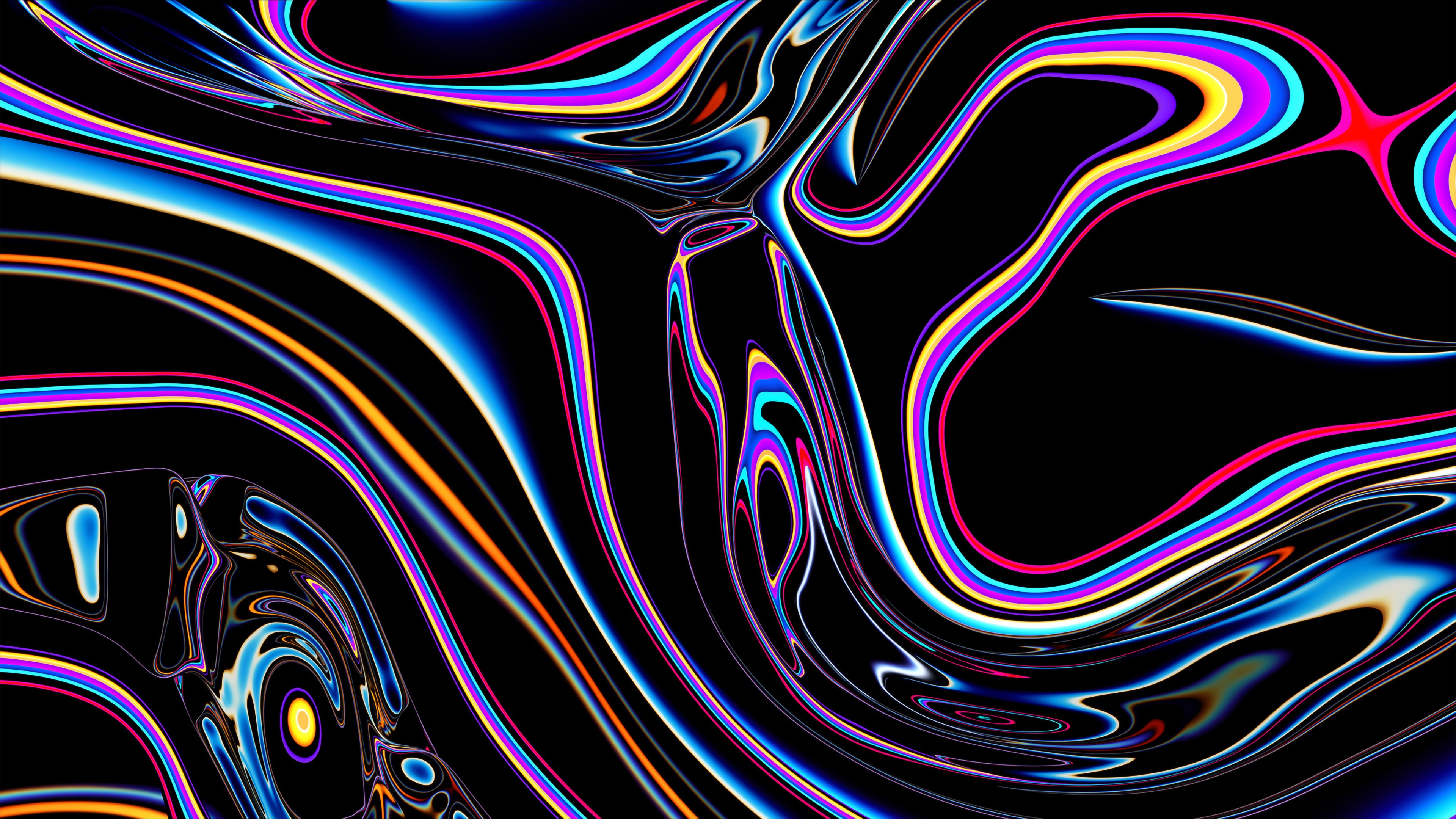
Sample Image
Here’s an example of a clean visual composition. Great design balances whitespace, contrast, and rhythm — ensuring every element feels intentional.

Code Example
/* Design token example */
:root {
  --color-primary: #6366f1;
  --radius-lg: 1rem;
  --font-display: "Inter", sans-serif;
}
Blockquote
"Design creates culture. Culture shapes values. Values determine the future." — Robert L. Peters
Design System Comparison
| System | Approach | Used By |
|---|---|---|
| Material Design | Component-Driven | Google, Android |
| Human Interface | Guideline-Based | Apple |
| Fluent Design | Motion & Depth | Microsoft |
Inline Elements
Use bold text for emphasis, italics for tone, underlines for clarity, and links for action. Inline tokens and highlighted terms help guide focus in design documentation.
Definition List
- Design Token
- A single source of truth for UI styles like color or spacing.
- Component
- A reusable UI element with defined behavior and appearance.
- Prototype
- An interactive mockup used to test user flows and layouts.
Details and Summary
Click to view design system tips
Start small — document buttons, colors, and typography first. Expand gradually into complex components.
Superscript & Subscript
A perfect grid ratio like 8n ensures visual harmony, while baseline spacing of 4px keeps everything aligned.
Conclusion
Good design is invisible — it guides, informs, and delights without distraction. Whether you’re building a portfolio or a full design system, consistency and care are your best tools for lasting impact.
भविष्य की डिज़ाइनिंग: सुंदर डिजिटल अनुभवों का निर्माण
आधुनिक डिज़ाइन केवल सौंदर्यशास्त्र के बारे में नहीं है — यह सार्थक अनुभव बनाने की कला है। रंग प्रणाली से लेकर गति (motion) तक, आज के डिज़ाइन टूल रचनाकारों को सटीकता और सुंदरता के साथ विचारों को व्यक्त करने की शक्ति देते हैं। इस लेख में, हम जानेंगे कि विचारशील डिज़ाइन सिस्टम आधुनिक वेब को कैसे आकार देते हैं।
परिचय
Figma, Framer और Penpot जैसे डिज़ाइन टूल के साथ, डिज़ाइनरों और डेवलपर्स के बीच सहयोग पहले से कहीं अधिक सहज हो गया है। एकीकृत डिज़ाइन भाषा ब्रांड की एकरूपता सुनिश्चित करती है और उत्पाद विकास की गति बढ़ाती है।
आधुनिक डिज़ाइन के मूल सिद्धांत
- जटिलता पर स्पष्टता
- उद्देश्यपूर्ण रंग और टाइपोग्राफी
- पहुँचयोग्यता और समावेशिता को प्राथमिकता देना
डिज़ाइनरों के लिए आवश्यक टूल
- UI डिज़ाइन के लिए Figma या Sketch
- वेक्टर ग्राफ़िक्स के लिए Adobe Illustrator
- प्रोटोटाइपिंग के लिए Framer या Webflow
डिज़ाइन वर्कफ़्लो चेकलिस्ट
-
रंग और टाइप स्केल निर्धारित करें
-
पुन: उपयोग योग्य डिज़ाइन घटक बनाएँ
-
पहुँचयोग्यता के लिए लेआउट का परीक्षण करें
नमूना छवि
यहाँ एक साफ़ और संतुलित दृश्य रचना का उदाहरण दिया गया है। अच्छी डिज़ाइन में व्हाइटस्पेस, कंट्रास्ट और लय (rhythm) का संतुलन होता है — जिससे हर तत्व उद्देश्यपूर्ण महसूस होता है।
कोड उदाहरण
/* डिज़ाइन टोकन उदाहरण */
:root {
  --color-primary: #6366f1;
  --radius-lg: 1rem;
  --font-display: "Inter", sans-serif;
}
उद्धरण
"डिज़ाइन संस्कृति बनाता है। संस्कृति मूल्य निर्धारित करती है। मूल्य भविष्य को आकार देते हैं।" — रॉबर्ट एल. पीटर्स
डिज़ाइन सिस्टम तुलना
| सिस्टम | दृष्टिकोण | किसके द्वारा उपयोग |
|---|---|---|
| Material Design | घटक-आधारित (Component-Driven) | Google, Android |
| Human Interface | मार्गदर्शक-आधारित (Guideline-Based) | Apple |
| Fluent Design | गति और गहराई (Motion & Depth) | Microsoft |
इनलाइन तत्व
ज़ोर देने के लिए बोल्ड टेक्स्ट का उपयोग करें, स्वर के लिए इटैलिक, स्पष्टता के लिए रेखांकित टेक्स्ट, और कार्रवाई के लिए लिंक का उपयोग करें। इनलाइन टोकन और हाइलाइट किए गए शब्द डिज़ाइन दस्तावेज़ों में ध्यान केंद्रित करने में मदद करते हैं।
परिभाषा सूची
- डिज़ाइन टोकन
- UI शैलियों जैसे रंग या स्पेसिंग के लिए एकल स्रोत सत्य (Single source of truth)।
- घटक (Component)
- एक पुन: उपयोग योग्य UI तत्व जिसके व्यवहार और रूप परिभाषित हों।
- प्रोटोटाइप
- एक इंटरैक्टिव मॉकअप जिसका उपयोग उपयोगकर्ता प्रवाह और लेआउट को परीक्षण करने के लिए किया जाता है।
विवरण और सारांश
डिज़ाइन सिस्टम टिप्स देखने के लिए क्लिक करें
छोटे से शुरू करें — पहले बटन, रंग और टाइपोग्राफी का दस्तावेज़ बनाएँ। फिर धीरे-धीरे जटिल घटकों तक विस्तार करें।
सुपरस्क्रिप्ट और सबस्क्रिप्ट
8n जैसी एक परिपूर्ण ग्रिड अनुपात दृश्य सामंजस्य सुनिश्चित करता है, जबकि 4px का बेसलाइन स्पेसिंग सब कुछ संरेखित रखता है।
निष्कर्ष
अच्छी डिज़ाइन अदृश्य होती है — यह मार्गदर्शन करती है, जानकारी देती है और ध्यान भटकाए बिना प्रसन्न करती है। चाहे आप एक पोर्टफोलियो बना रहे हों या एक पूर्ण डिज़ाइन सिस्टम, स्थिरता और सावधानी ही स्थायी प्रभाव के लिए आपकी सर्वोत्तम उपकरण हैं।
تصميم المستقبل: ابتكار تجارب رقمية جميلة
التصميم الحديث ليس مجرد جماليات — بل هو عن إنشاء تجارب ذات معنى. من أنظمة الألوان إلى الحركة، تمنح أدوات التصميم اليوم المبدعين القدرة على التعبير عن أفكارهم بدقة وأناقة. في هذا المقال، سنستكشف كيف تُشكّل أنظمة التصميم المدروسة شبكة الويب الحديثة.
المقدمة
بفضل أدوات التصميم مثل Figma وFramer وPenpot، أصبح التعاون بين المصممين والمطورين أسهل من أي وقت مضى. تضمن لغة التصميم الموحدة اتساق الهوية البصرية وتسريع عملية تطوير المنتجات.
المبادئ الأساسية للتصميم الحديث
- الوضوح قبل التعقيد
- ألوان وخطوط مدفوعة بالغاية
- إمكانية الوصول والشمولية كمعيار أساسي
الأدوات الأساسية للمصممين
- Figma أو Sketch لتصميم واجهات المستخدم
- Adobe Illustrator للرسومات المتجهة
- Framer أو Webflow للنماذج التفاعلية
قائمة تدقيق سير عمل التصميم
-
تحديد مقياس الألوان والخطوط
-
إنشاء مكونات تصميم قابلة لإعادة الاستخدام
-
اختبار تخطيطات التصميم من حيث إمكانية الوصول
صورة توضيحية
إليك مثال على تكوين بصري نظيف ومتوازن. التصميم الجيد يوازن بين المساحات البيضاء والتباين والإيقاع — مما يجعل كل عنصر يبدو مقصوداً ومتناسقاً.
مثال على كود
/* مثال على رموز التصميم */
:root {
  --color-primary: #6366f1;
  --radius-lg: 1rem;
  --font-display: "Inter", sans-serif;
}
اقتباس
"التصميم يصنع الثقافة. الثقافة تشكل القيم. القيم تحدد المستقبل." — روبرت ل. بيترز
مقارنة بين أنظمة التصميم
| النظام | المنهج | يُستخدم من قبل |
|---|---|---|
| Material Design | قائم على المكونات | Google, Android |
| Human Interface | قائم على الإرشادات | Apple |
| Fluent Design | الحركة والعمق | Microsoft |
العناصر المضمنة
استخدم النص العريض للتأكيد، والمائل للنبرة، والتسطير للتوضيح، والروابط للتفاعل. تساعد الرموز المضمنة والكلمات المميزة على توجيه الانتباه في وثائق التصميم.
قائمة التعريفات
- رمز التصميم
- مصدر موحد للحقيقة لأنماط واجهة المستخدم مثل اللون أو التباعد.
- المكون
- عنصر واجهة مستخدم قابل لإعادة الاستخدام بسلوك وشكل محددين.
- النموذج الأولي
- تصميم تفاعلي يستخدم لاختبار تدفقات المستخدم وتخطيطات الواجهة.
تفاصيل وملخص
انقر لعرض نصائح أنظمة التصميم
ابدأ صغيراً — وثّق الأزرار والألوان والخطوط أولاً. ثم توسع تدريجياً إلى المكونات الأكثر تعقيداً.
الأسس الفوقية والتحتية
نسبة الشبكة المثالية مثل 8n تضمن التناسق البصري، في حين أن تباعد الأساس بمقدار 4px يحافظ على محاذاة كل شيء بدقة.
الخاتمة
التصميم الجيد غير مرئي — فهو يوجه ويوضح ويبهج دون تشتيت. سواء كنت تبني معرض أعمال أو نظام تصميم كامل، فإن الاتساق والعناية هما أفضل أدواتك للتأثير الدائم.
Diseñando el futuro: Creando experiencias digitales hermosas
El diseño moderno es mucho más que estética: se trata de crear experiencias significativas. Desde los sistemas de color hasta el movimiento, las herramientas de diseño actuales permiten a los creadores expresar ideas con precisión y elegancia. En este artículo, exploraremos cómo los sistemas de diseño bien pensados dan forma a la web moderna.
Introducción
Con herramientas de diseño como Figma, Framer y Penpot, la colaboración entre diseñadores y desarrolladores nunca ha sido tan fluida. Un lenguaje de diseño unificado garantiza la coherencia de la marca y acelera la entrega de productos.
Principios fundamentales del diseño moderno
- Claridad sobre complejidad
- Color y tipografía con propósito
- Accesibilidad e inclusión por defecto
Herramientas esenciales para diseñadores
- Figma o Sketch para diseño de interfaces
- Adobe Illustrator para gráficos vectoriales
- Framer o Webflow para prototipado
Lista de verificación del flujo de trabajo de diseño
-
Establecer escalas de color y tipografía
-
Crear componentes de diseño reutilizables
-
Probar los diseños para asegurar accesibilidad
Imagen de muestra
Aquí tienes un ejemplo de una composición visual limpia. Un buen diseño equilibra el espacio en blanco, el contraste y el ritmo, asegurando que cada elemento parezca intencional.
Ejemplo de código
/* Ejemplo de token de diseño */
:root {
  --color-primary: #6366f1;
  --radius-lg: 1rem;
  --font-display: "Inter", sans-serif;
}
Cita
"El diseño crea cultura. La cultura da forma a los valores. Los valores determinan el futuro." — Robert L. Peters
Comparación de sistemas de diseño
| Sistema | Enfoque | Usado por |
|---|---|---|
| Material Design | Basado en componentes | Google, Android |
| Human Interface | Basado en guías | Apple |
| Fluent Design | Movimiento y profundidad | Microsoft |
Elementos en línea
Usa texto en negrita para énfasis, cursiva para tono, subrayado para claridad y enlaces para acción. Los tokens en línea y los términos resaltados ayudan a guiar la atención en la documentación de diseño.
Lista de definiciones
- Token de diseño
- Fuente única de verdad para estilos de interfaz de usuario como color o espaciado.
- Componente
- Elemento de interfaz reutilizable con comportamiento y apariencia definidos.
- Prototipo
- Maqueta interactiva utilizada para probar flujos y estructuras de diseño.
Detalles y resumen
Haz clic para ver consejos sobre sistemas de diseño
Empieza con lo básico: documenta botones, colores y tipografía primero. Luego amplía gradualmente a componentes más complejos.
Superíndice y subíndice
Una proporción de cuadrícula perfecta como 8n garantiza armonía visual, mientras que un espaciado base de 4px mantiene todo alineado.
Conclusión
Un buen diseño es invisible: guía, informa y deleita sin distraer. Ya sea que estés construyendo un portafolio o un sistema de diseño completo, la consistencia y el cuidado son tus mejores herramientas para lograr un impacto duradero.
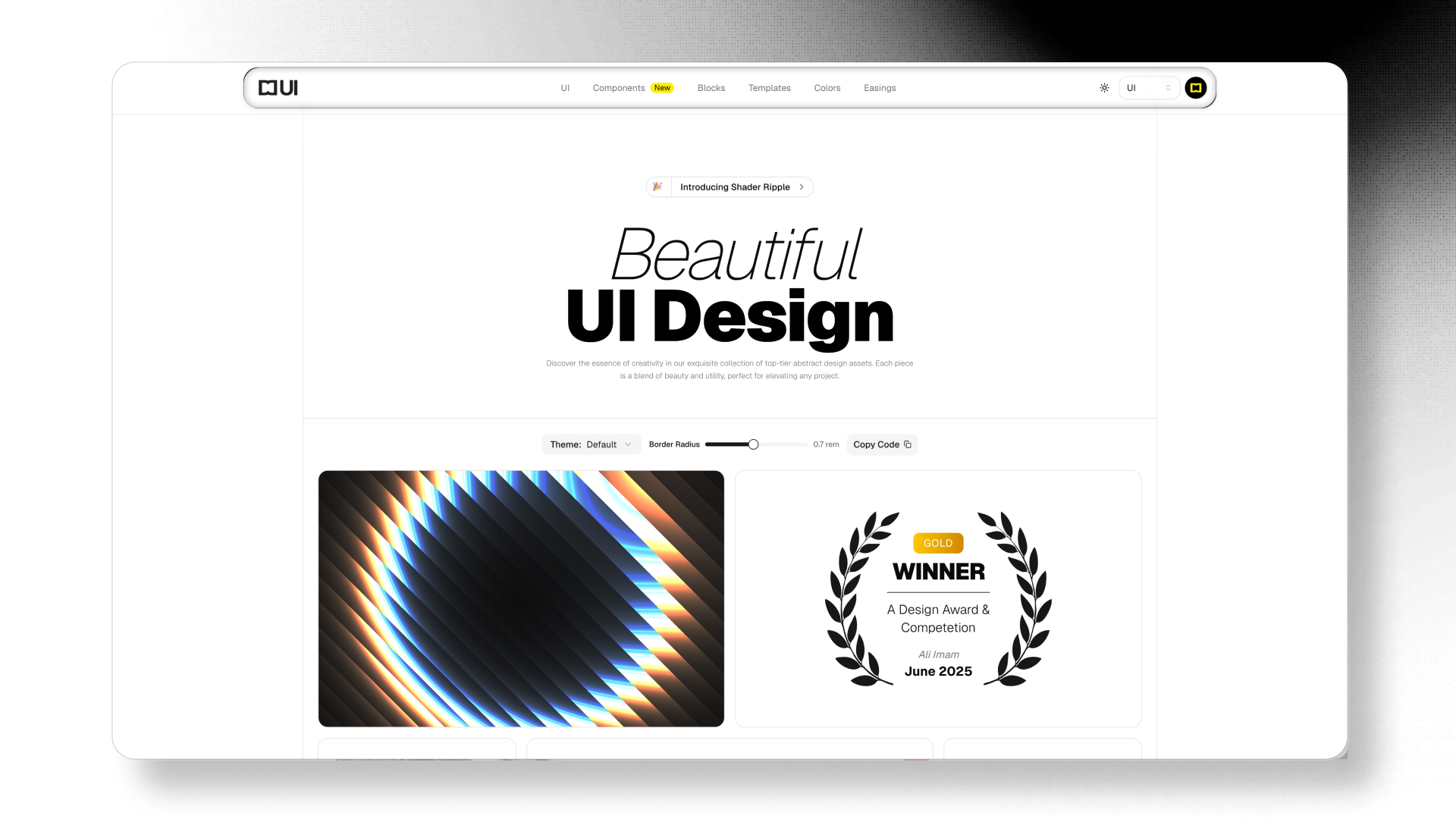
Certificate of WINNER
This is to certify that
Ali Imam
A Design Award & Competetion
The Scroll Progess is showing at bottom
Customize the scroll progress component with different variants and options
Example showing a simple scroll progress.